Pari
Aligned for what’s next
Working beside ambitious businesses to bring financial clarity and smarter systems into step.
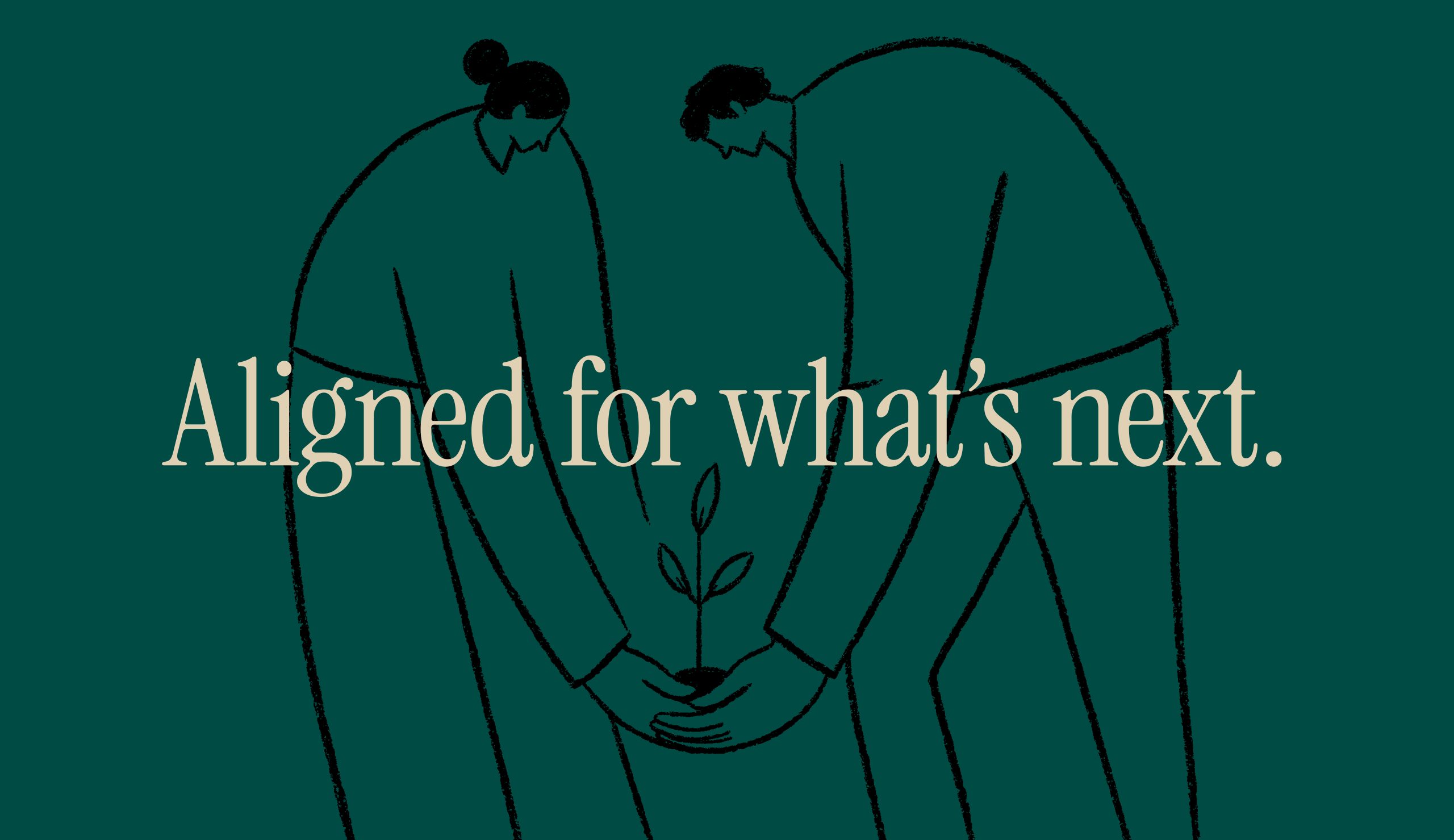
Australian businesses vastly lack financial and technological strategies—or have ones they can’t use. The opportunity for Pari was offering fractional Financial and Automation services, grounded in real experience. Founders Chelsea and Joel bring a full set of professional knowledge for the timeframe their clients need, with a philosophy of practicality that empowers growth rather than hindering it. This is partnering to realise potential.
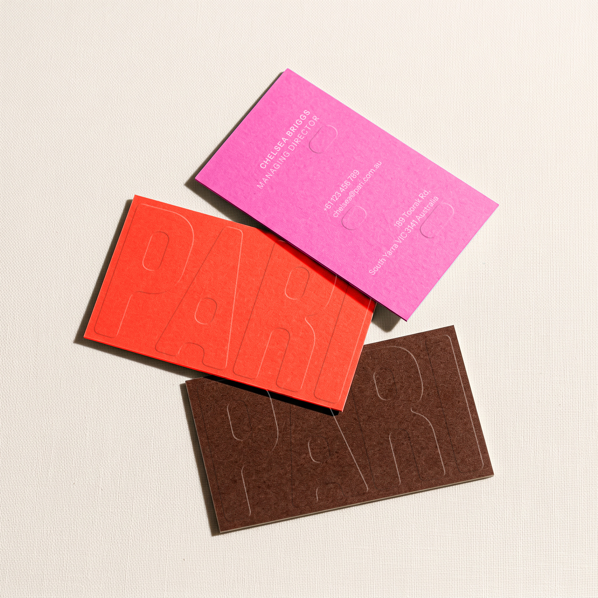

When you find the right people, everything clicks into place. Suddenly barriers become innovation, risks become manageable items, and processes equal power. ‘Pari’ is derived from parallel and the Latin par, meaning equal or on equal footing. It reflects the businesses’ close relationships to their clients and connecting the dots between today and what comes next.
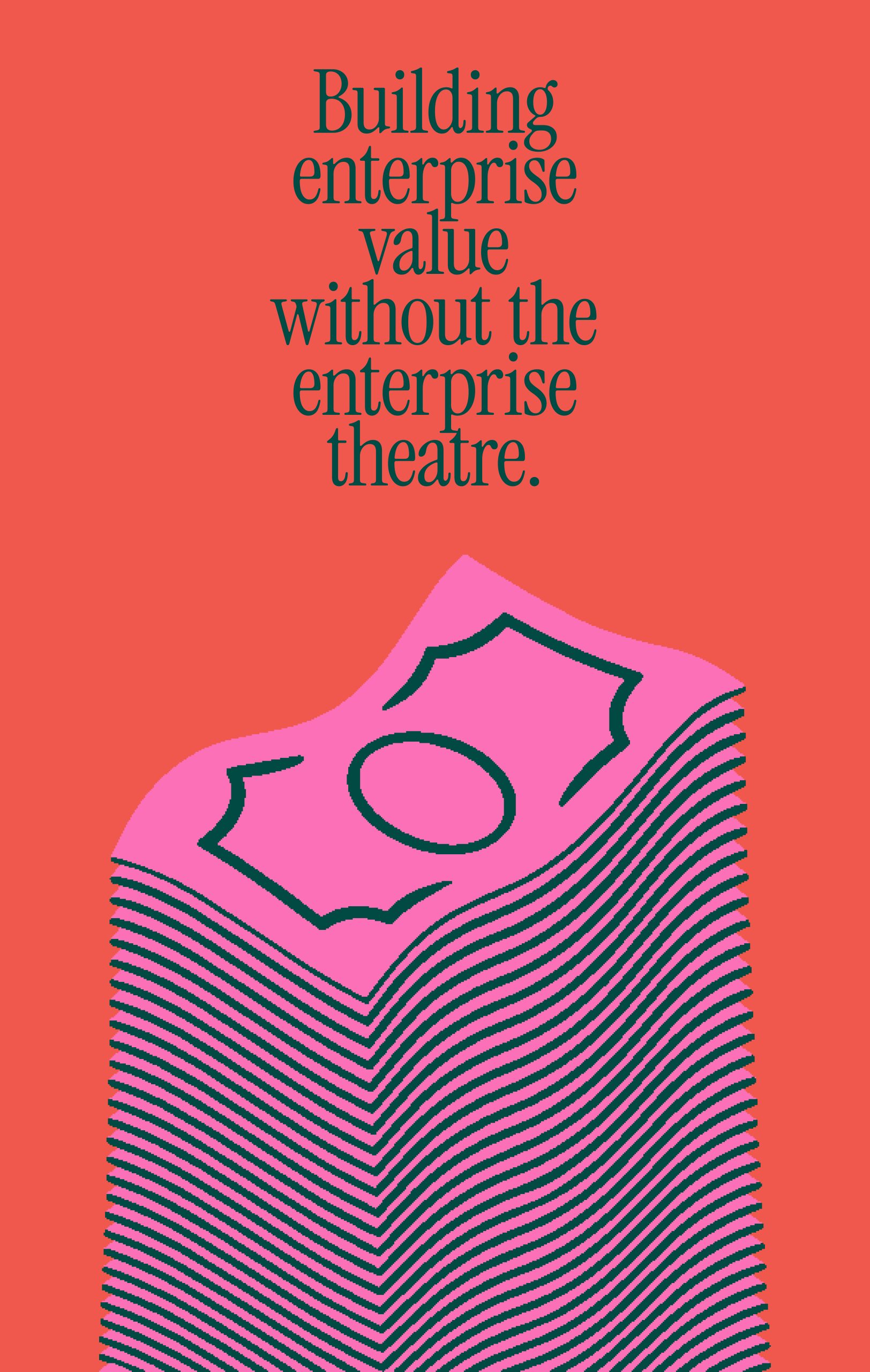

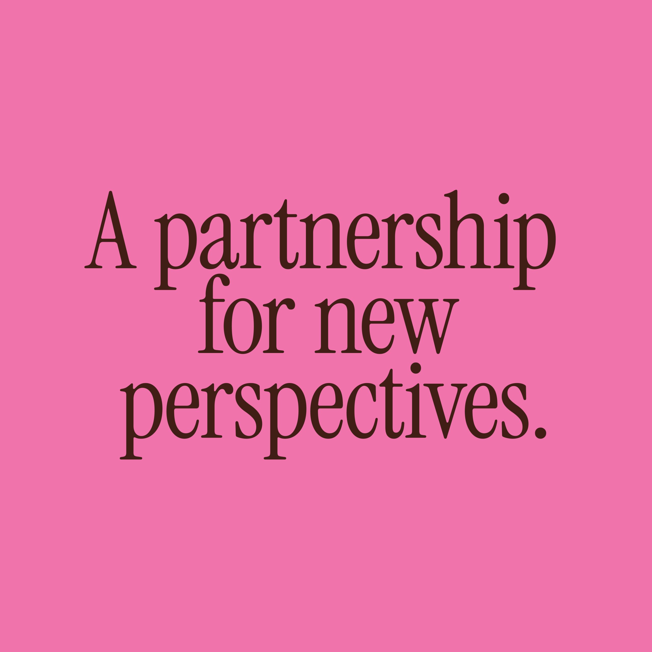
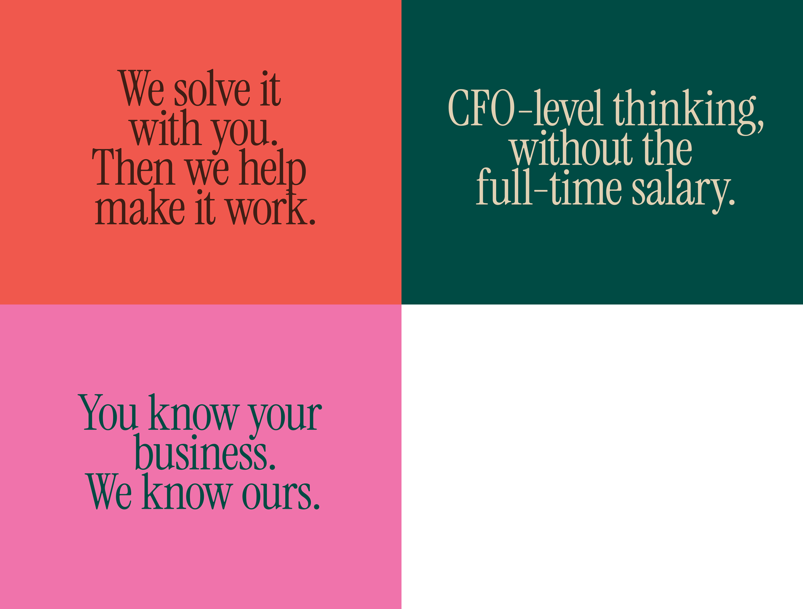
Finance and technology brands tend to look alike, built on corporate colour palettes, data graphics and promises of precision. In a category this uniform, the clearest point of difference was Pari’s people, so we built the brand around personality. The language is refreshing and honest—showing wit and plain speech—from the homepage to the invoice.
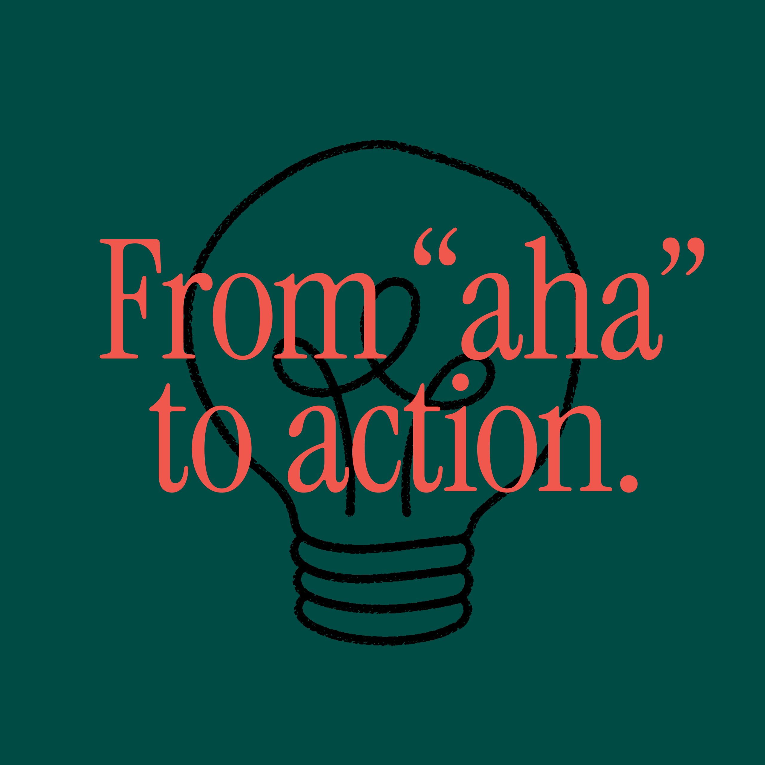
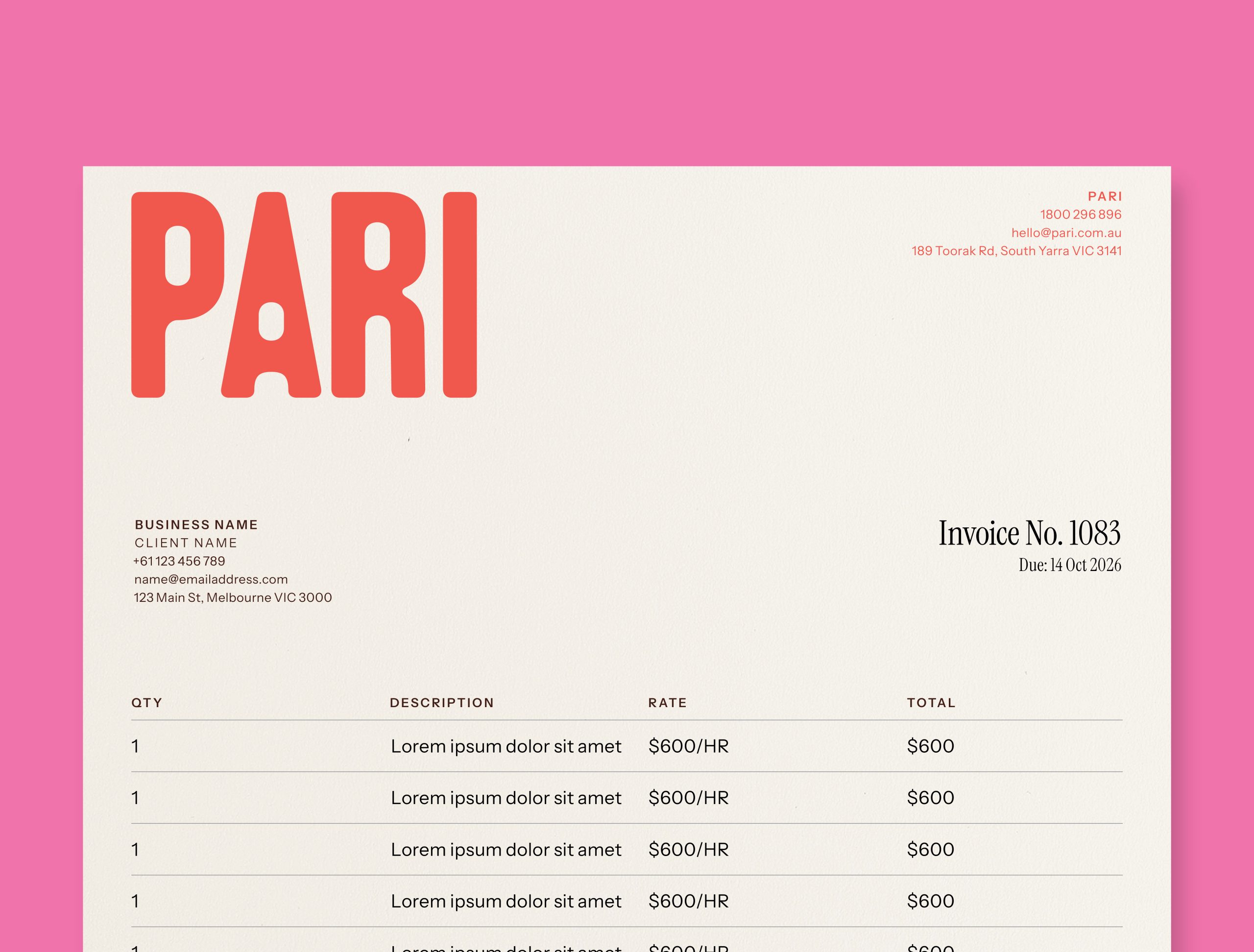
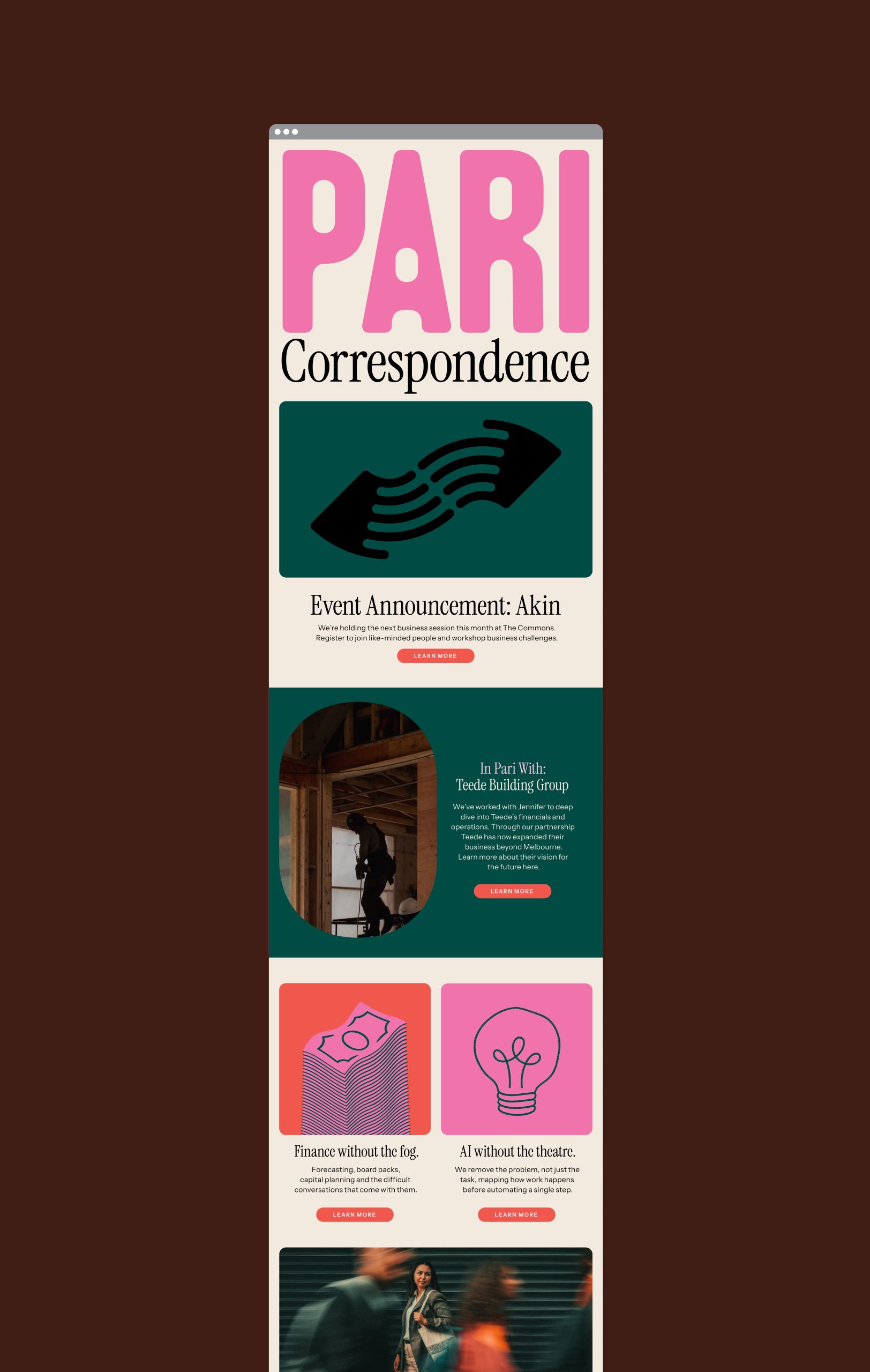
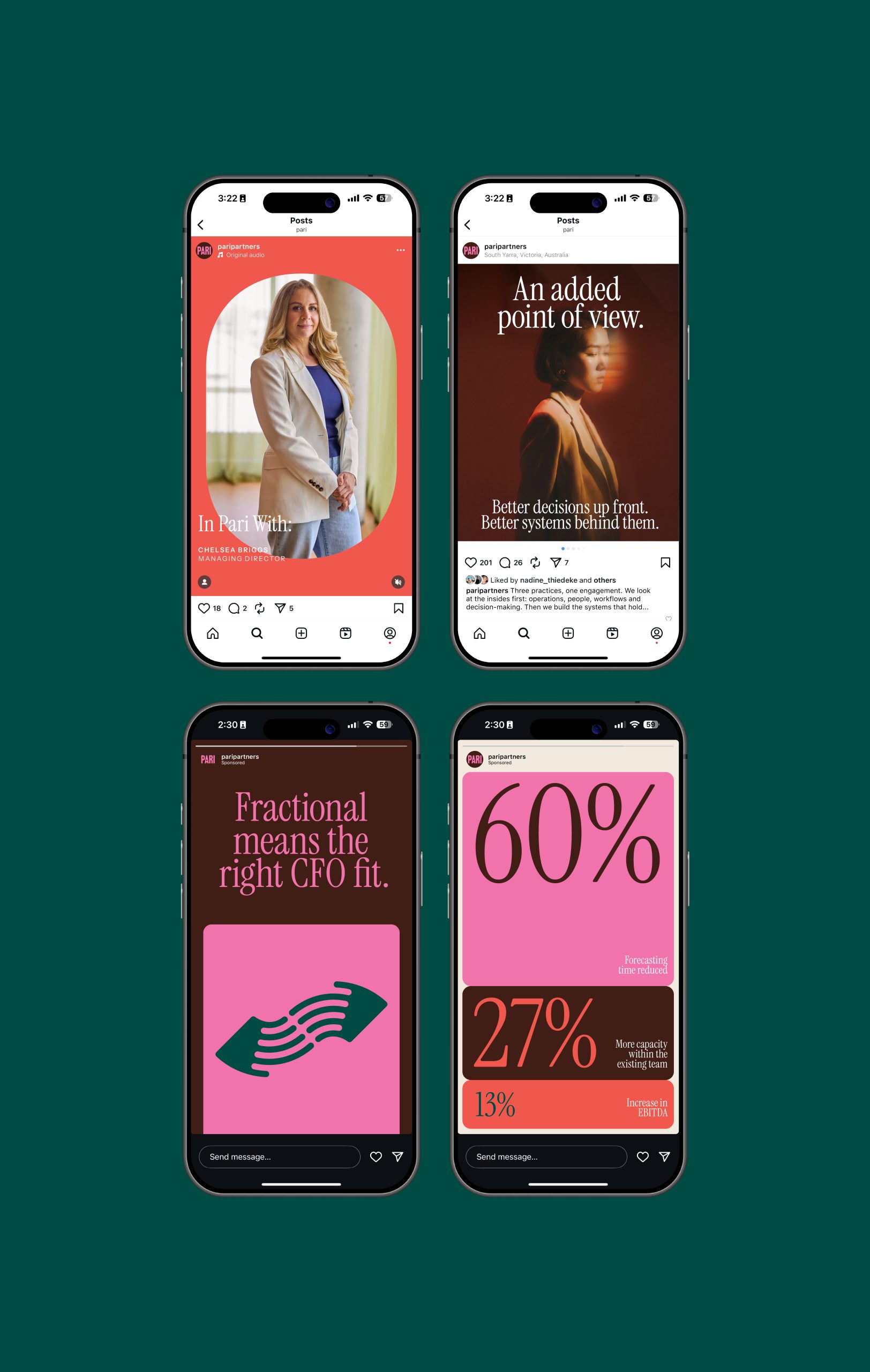
The visual identity carries the same character with hand-drawn figures, parallel ribbons and connected points bringing partnership to life with a human touch. They sit on a palette of deep green, coral and pink—warm, confident and nothing like what the category defaults to.
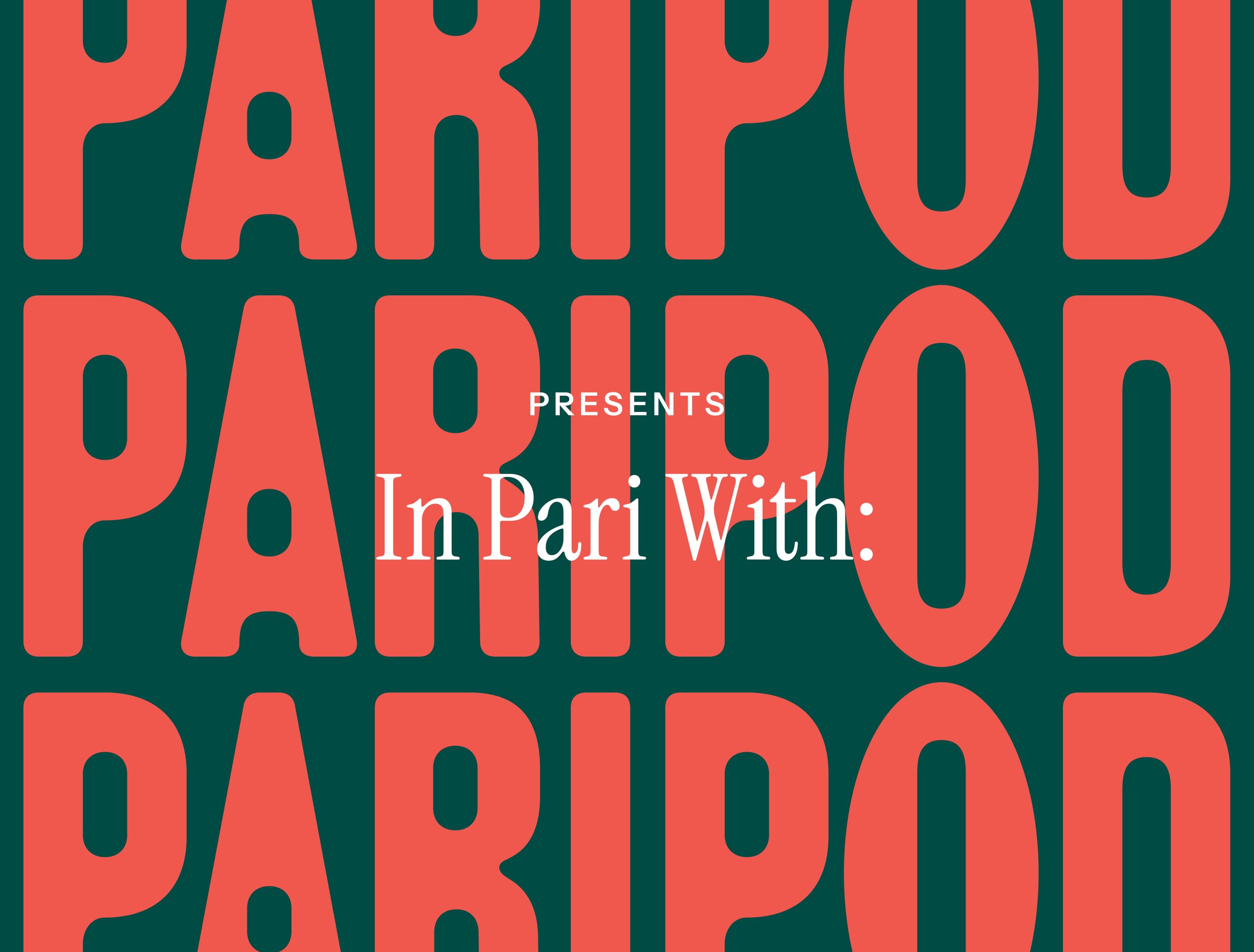
Playing off the notion of Pari as a tool for business, Instrument Serif has been paired with Instrument Sans for a cohesive, workhorse font family that balances both the personality and the functional needs of the brand. The condensed serif gives the headlines authority without formality, and photography puts the team front and centre.
The result is a brand that feels like the people behind it, real and aligned for what’s next.
More Projects
Creative Direction, Voice & Content, Brand Identity
Selected Clients
Google

Nike

Woolworths

Macro

QV Melbourne

Burwood One

Mirvac

Westside India

Zudio India

Eva

Art of Soule

Play-ground Coffee

Total Fusion Platinum

Tourism Victoria

JCDecaux

Open House Melbourne

Linda Boronkay

Genius Childcare

Mayfield Childcare

The Next Step

Hale Gym & Spa

Accor Hotels

Little National Hotel

Osborn House

DOMA Hotels

Hotel Realm

Louis Restaurant

Med Restaurant

The Alby

Leyla Bar

The Motley Hotel

Evra Restaurant

Quincy
Dexus

GPT

ISPT

Cbus Property

Charter Hall

Stockland

Colliers

Grollo Group

DOMA Group

Cavcorp

LDK

Amber Property Group

CAPAX
Toga Group
Far East Group