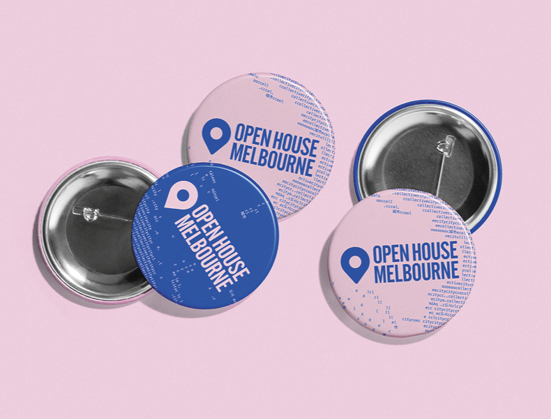
Open House Melbourne
A celebration of design and place
Since Studio Payne’s founding, Open House Melbourne has been a defining partnership—one that has shaped the studio’s voice as much as it has shaped the festival’s visual identity. Over seven consecutive years, Studio Payne has been the creative partner behind OHM’s annual campaign, translating each year’s civic theme into a cohesive visual language that reaches hundreds of thousands of Melburnians across digital, social, and physical touchpoints.
Open House Melbourne occupies an unusual position in the cultural calendar. It is simultaneously a mass-participation event and a platform for serious architectural discourse—a weekend that asks the general public to look differently at the city they move through every day. Each year, a new theme reframes that invitation.

The recurring creative challenge is not simply to design something new. It is to design something true—to the theme, to the city, and to an audience that ranges from architecture professionals to families discovering a building for the first time. The identity must work as a wayfinding system, a social media presence, a poster on a telephone pole, and a header in an email—all at once, all coherently.
The studio must also contend with the practical reality of a festival at scale: dozens of venues, multiple collaborating councils and precincts, volunteer-facing materials, ticketing platforms, and partner organisations who each need to carry the identity into their own channels. Flexibility without fragmentation is the perennial design problem.


Studio Payne’s method across the partnership has remained consistent even as the aesthetic has evolved: start with the idea, not the form. Each year’s campaign begins with a close reading of the theme—not as a brief to illustrate, but as a provocation to interrogate. The question the studio returns to each year is the same: what does it actually mean to encounter this city, and how does design make that encounter more vivid?
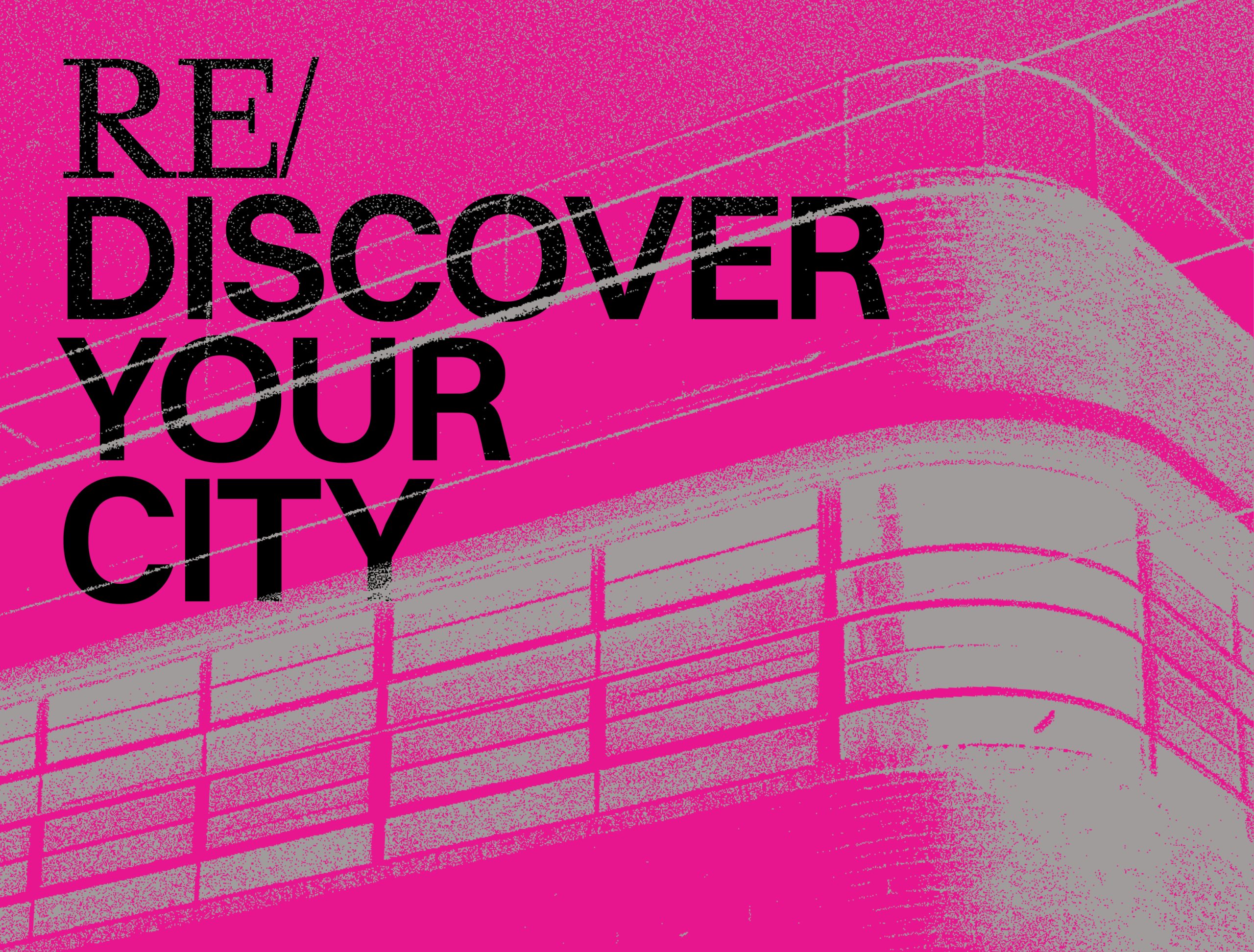

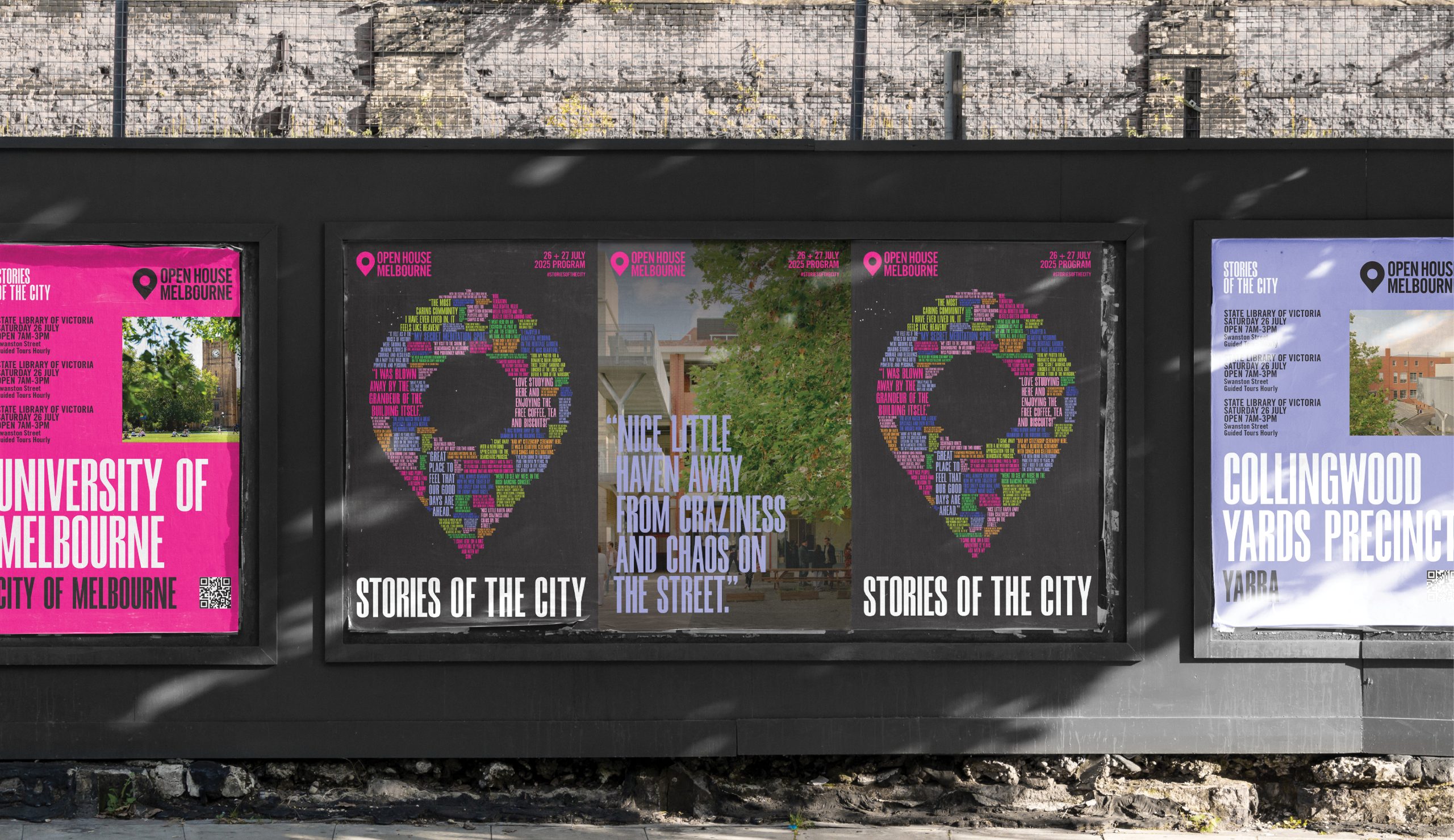
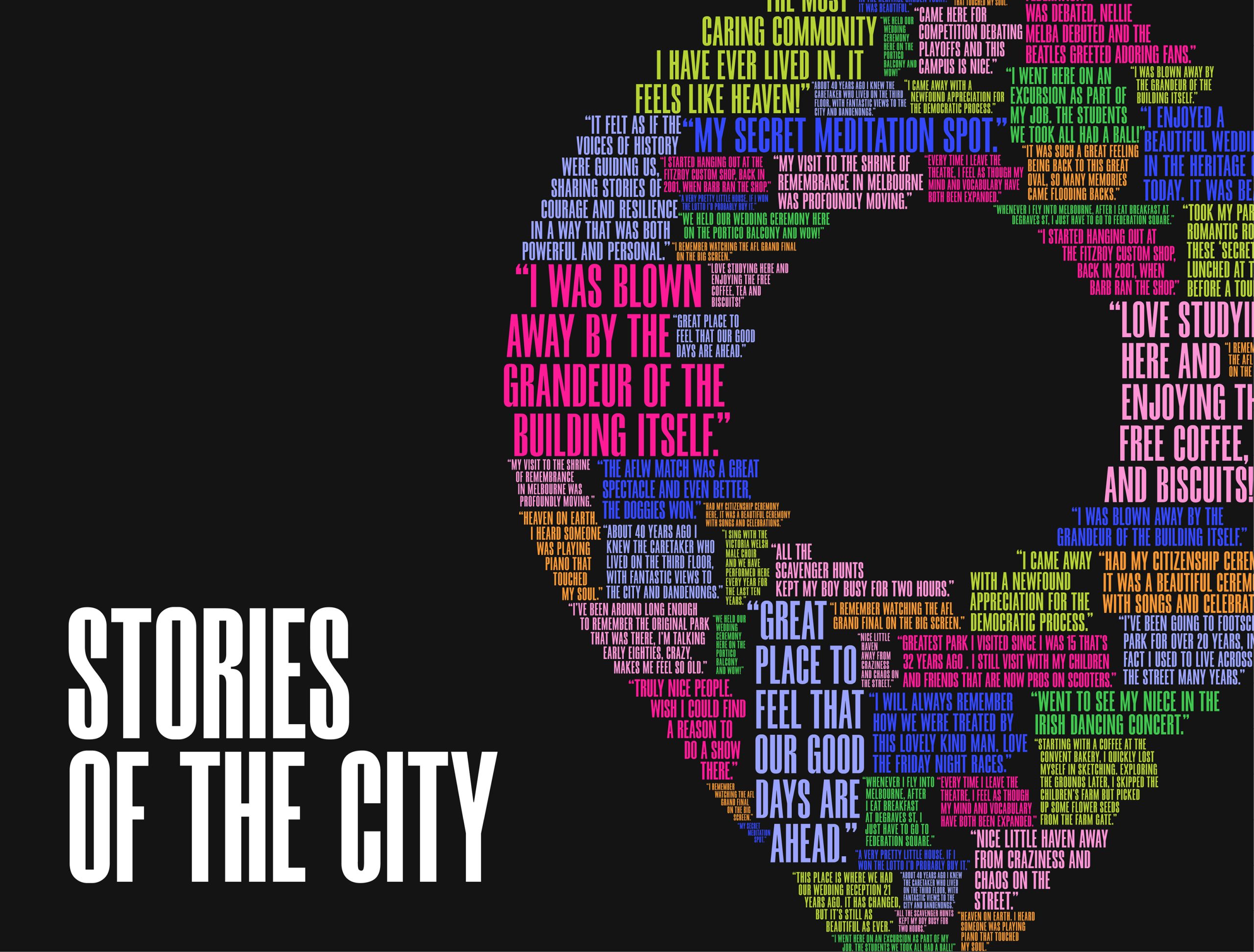
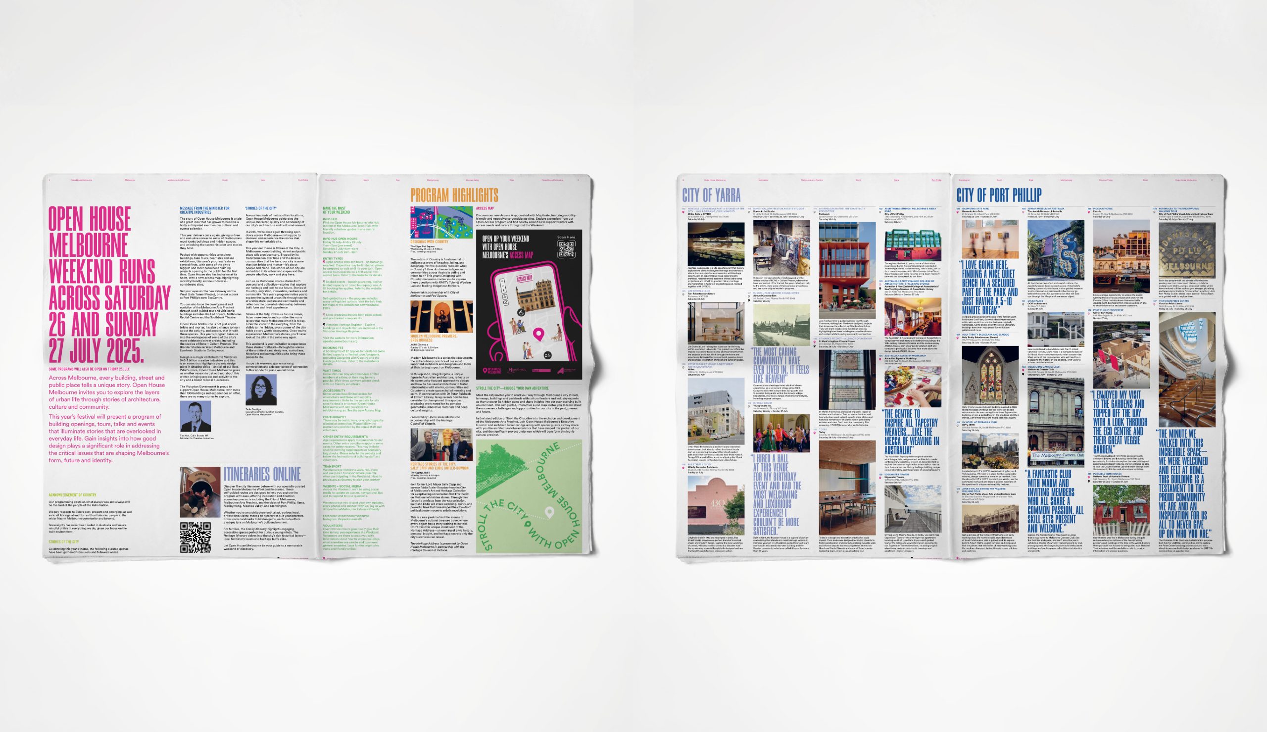
That question has produced a body of work with a clear and consistent character. Typography functions as architecture—structural, load-bearing, never decorative. Architectural photography is treated as raw material rather than illustration, pushed through contrast, grain, fragmentation, and layering until it yields something more charged than documentation. Colour is used with conviction: the magenta that anchors much of the visual identity is never softened into approachability. The system is bold because the city is bold, and because the audience—however diverse—responds to work that takes them seriously.

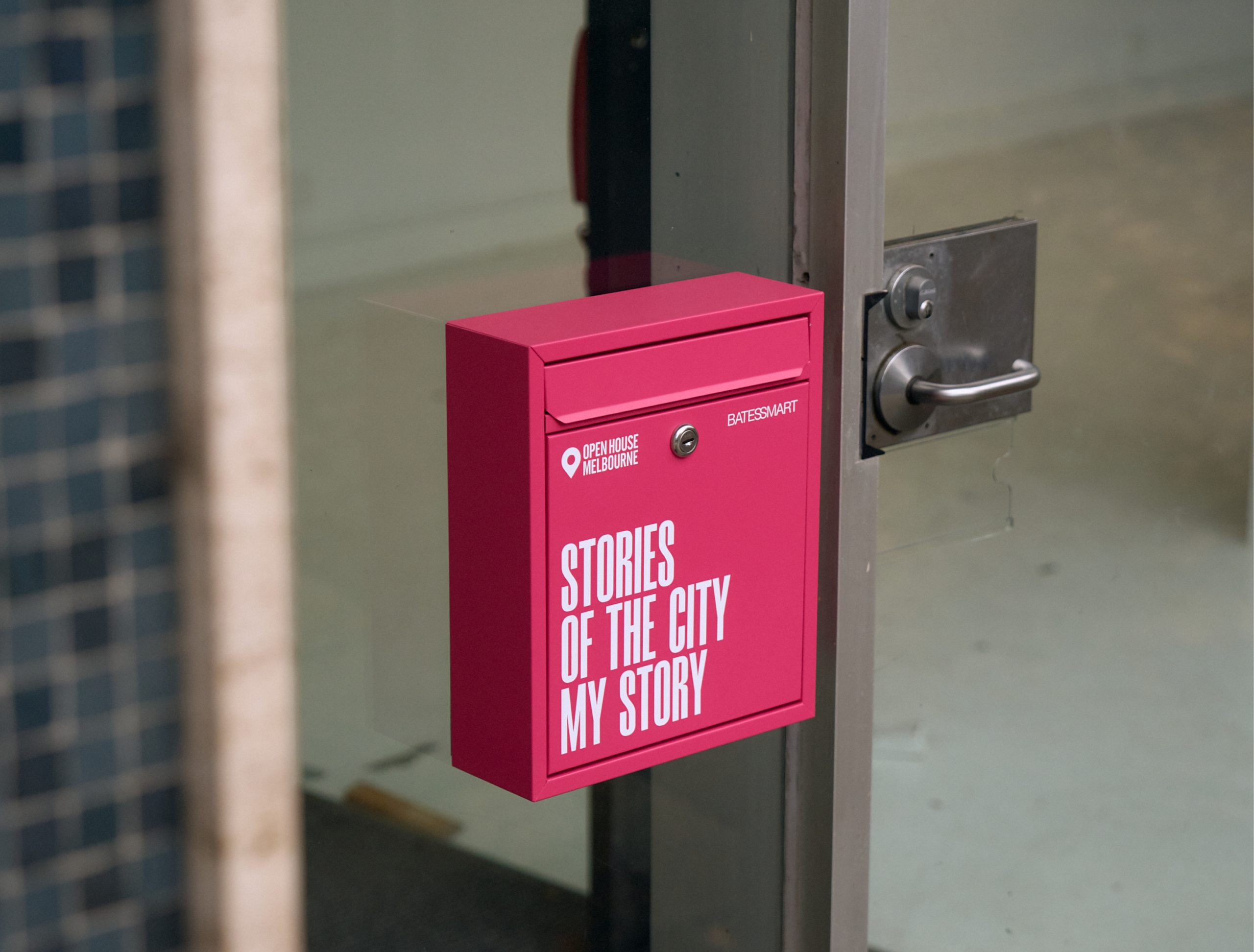
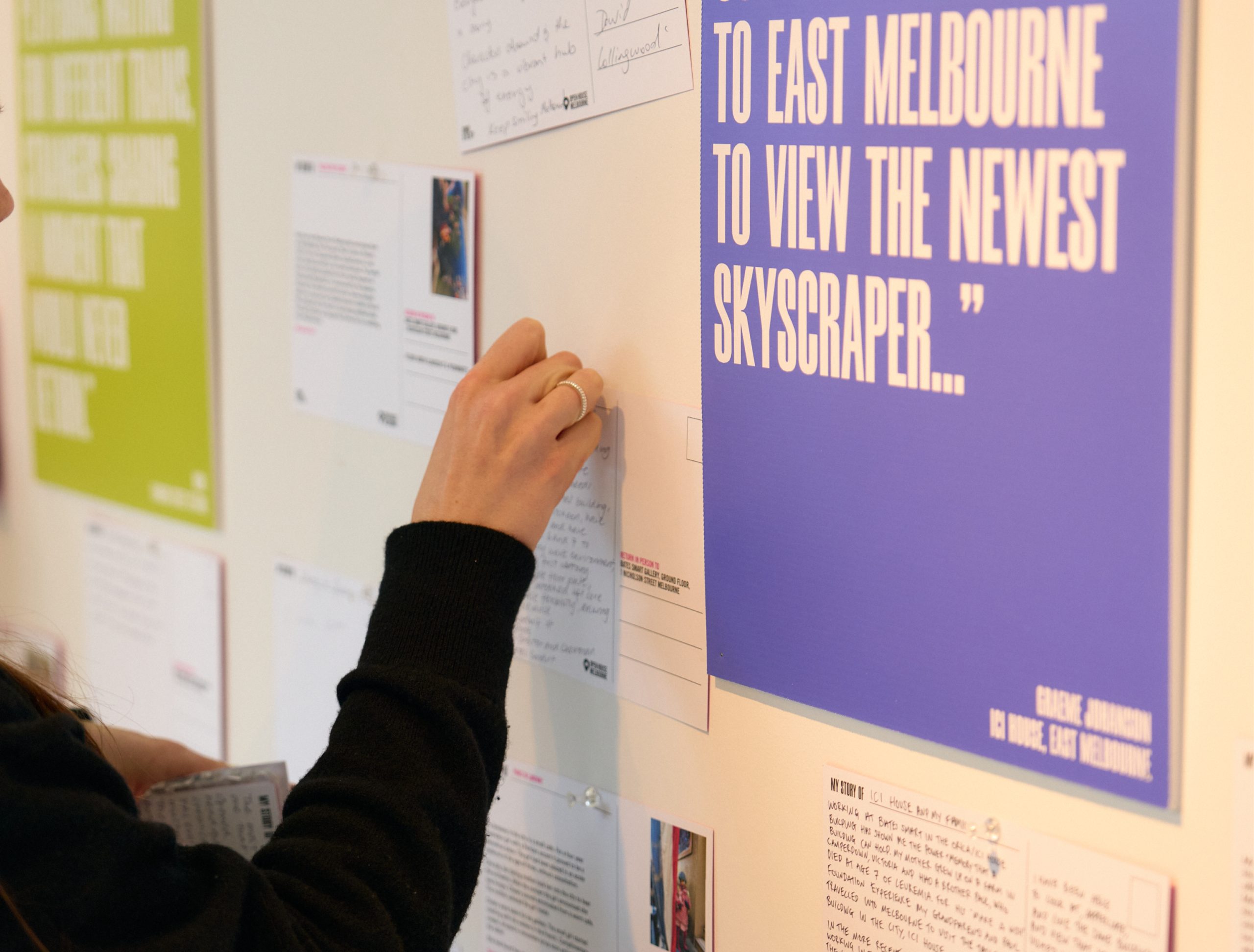
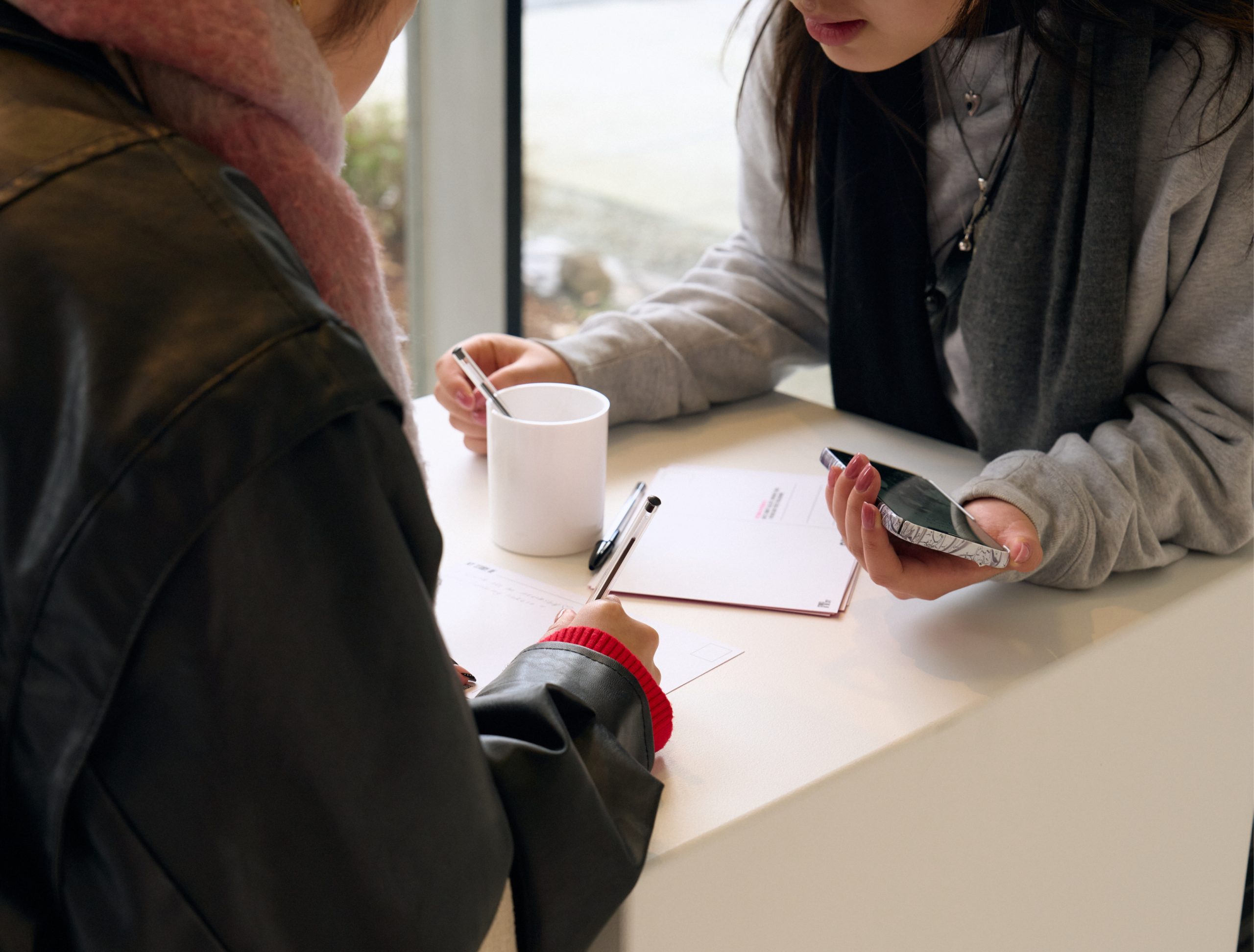
Each year’s theme has pushed the formal language into new territory without abandoning what came before. Early campaigns established the typographic grammar, using letterforms as frames for imagery and handwritten annotation to collapse the distance between architectural thinking and built form. Later work introduced ASCII character code and multilingual glyphs to construct buildings from the marks of individual people—a concept that was technically ambitious and conceptually precise, speaking directly to questions of belonging and collective identity. More recent campaigns have drawn on the real, unguarded language of Open House visitors—personal memories, offhand observations, moments of genuine wonder—weaving them into the visual system as both content and texture. In each case, the conceptual move and the formal move are the same move.
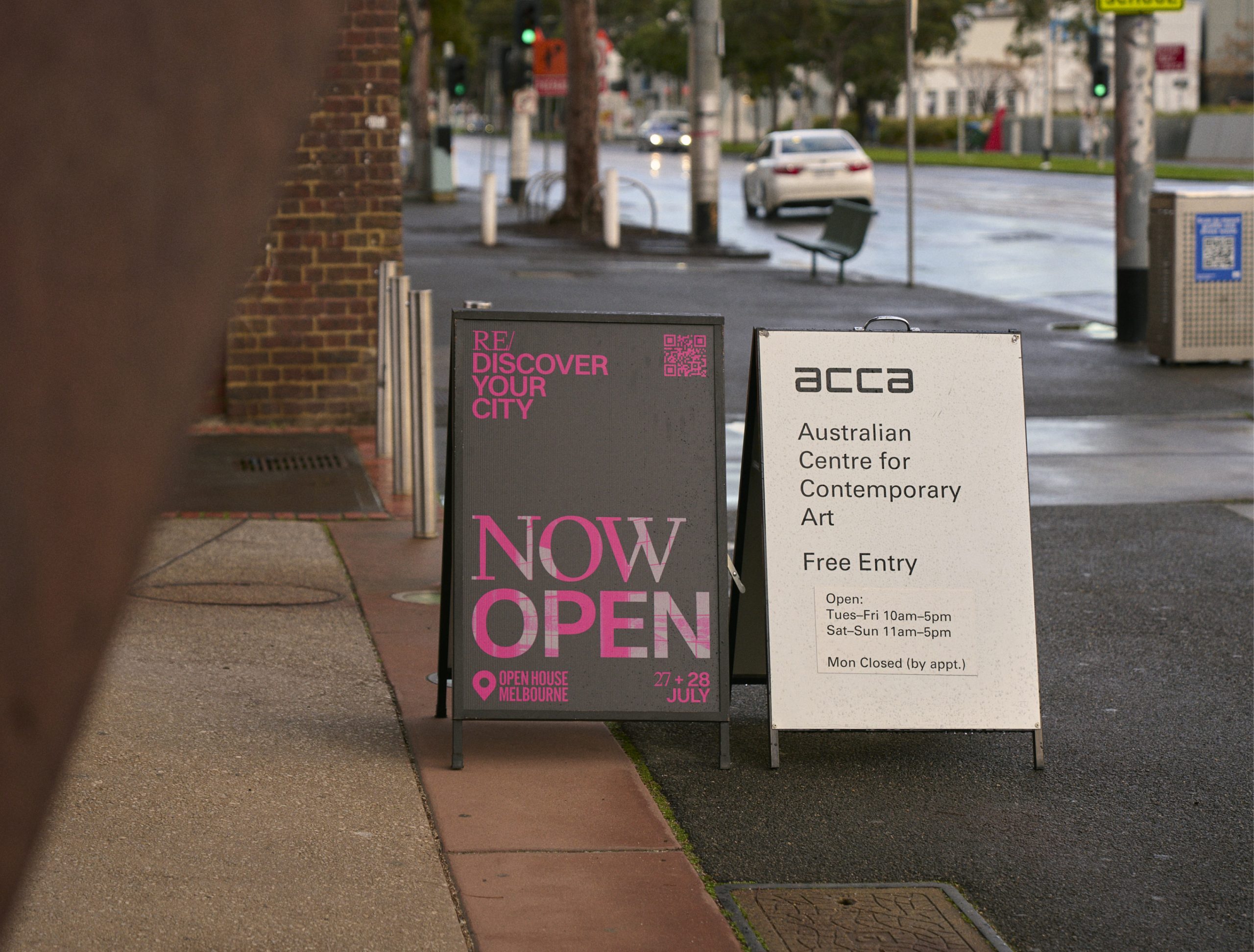
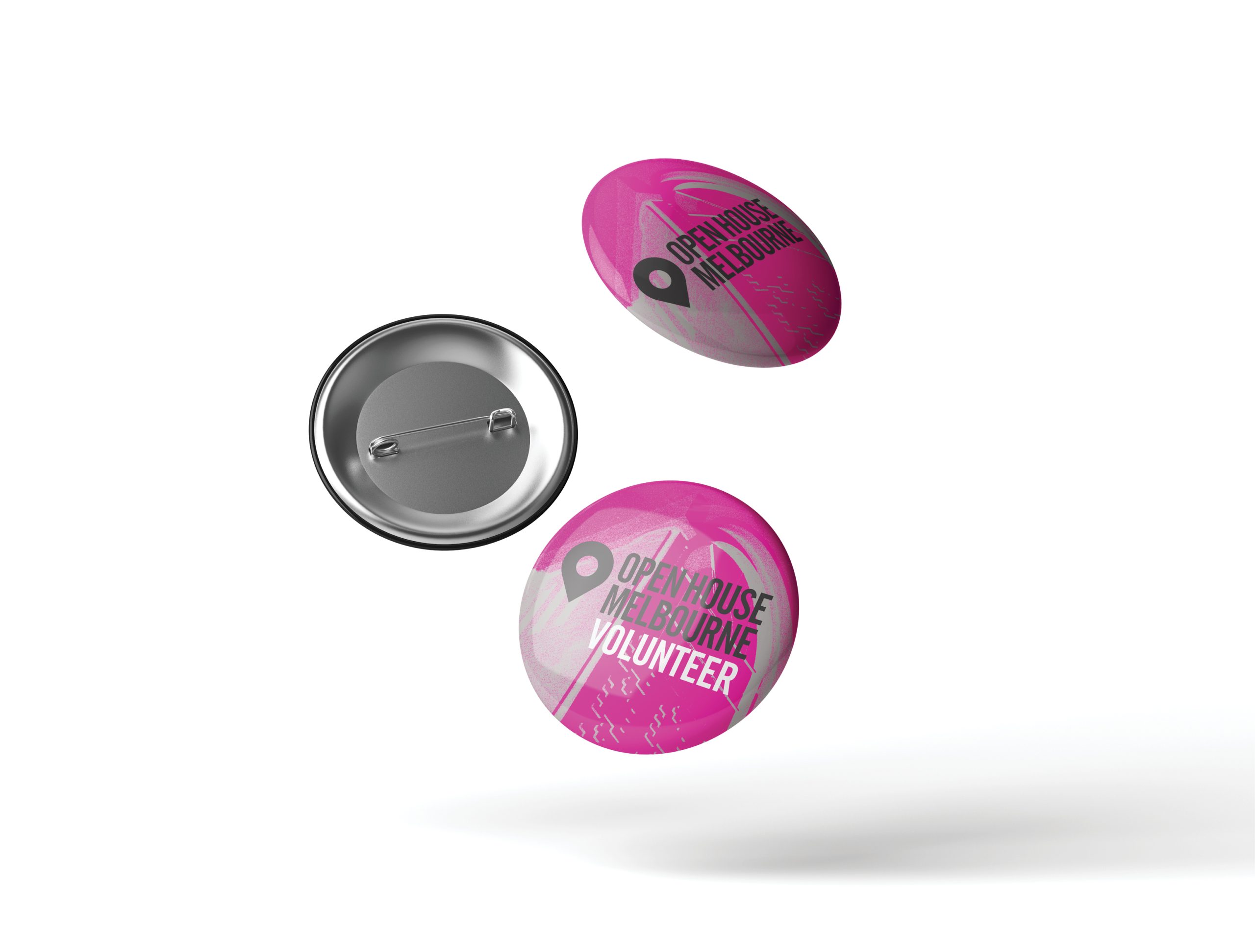
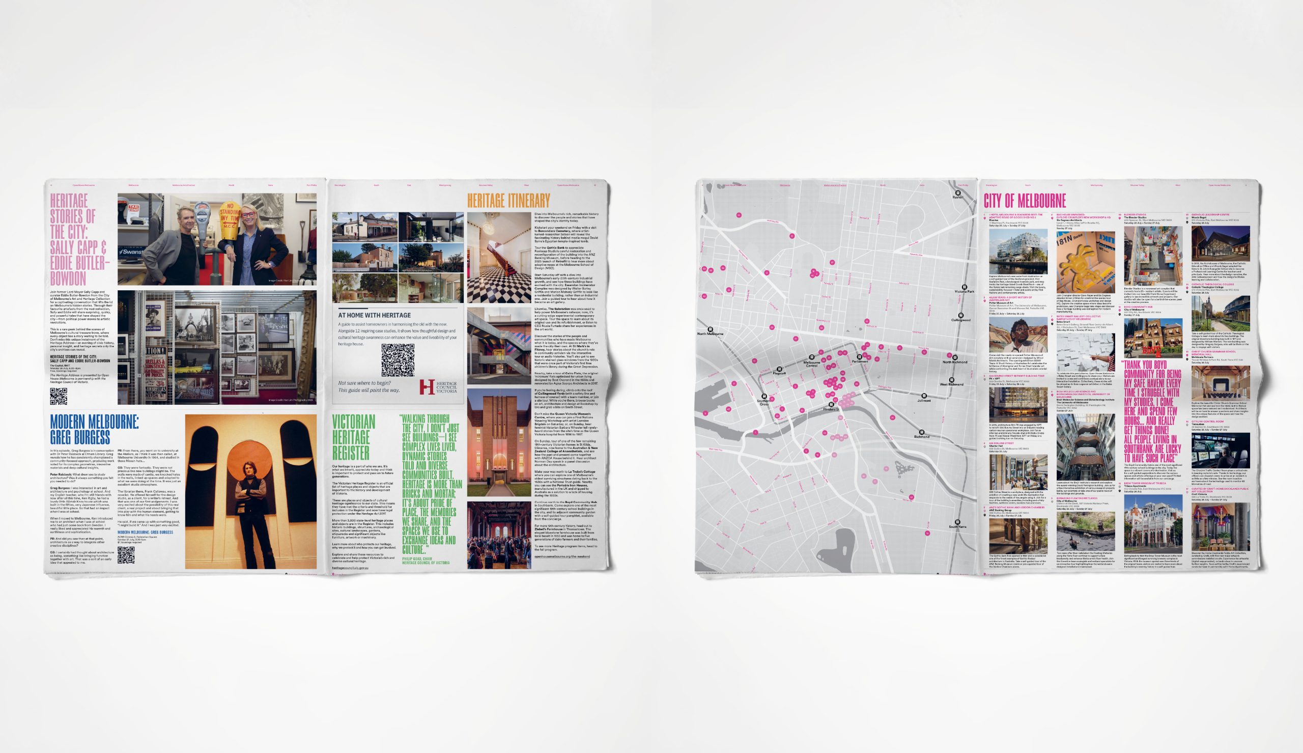
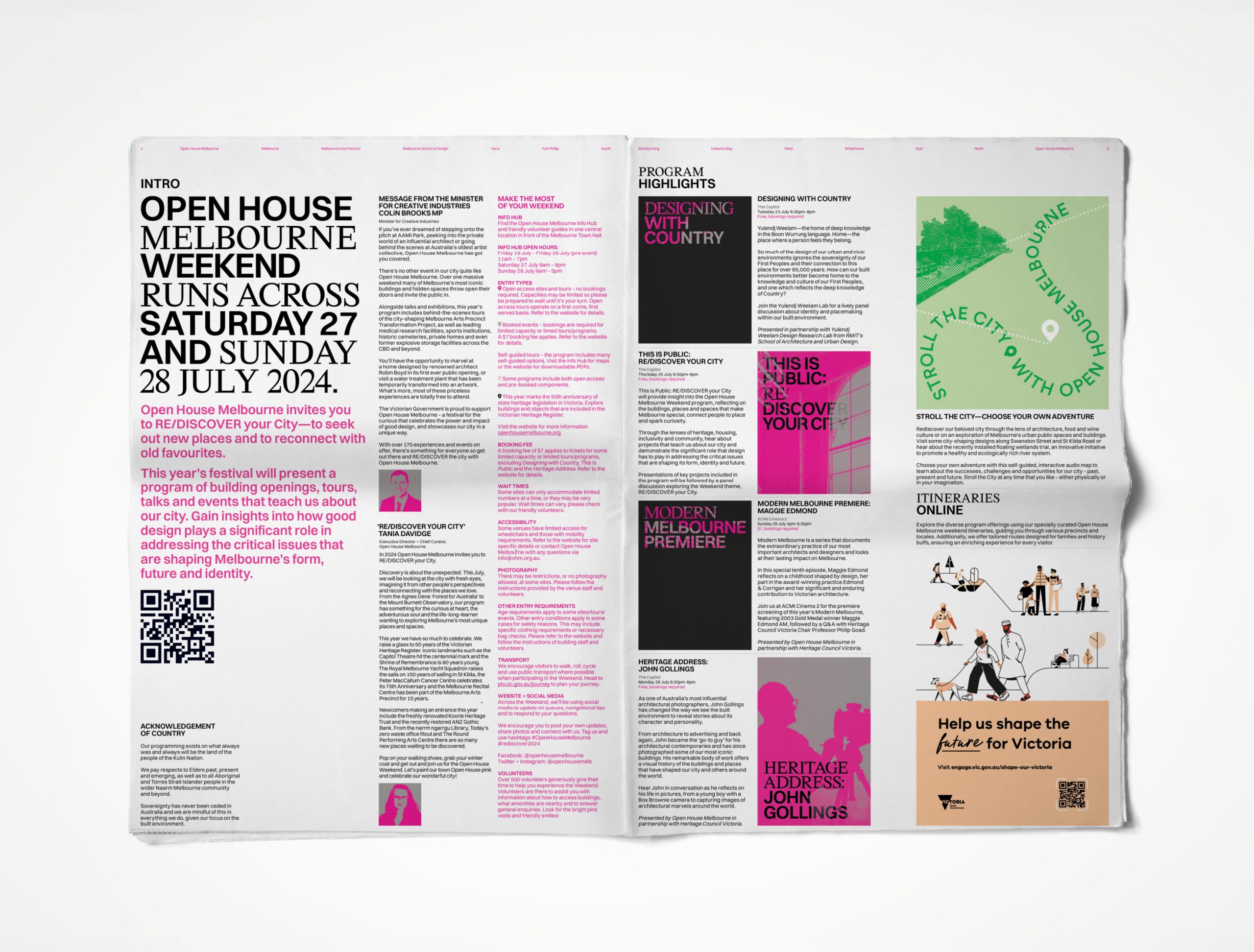
The practical demands of the partnership have required an equally rigorous approach to systems thinking. A campaign identity for Open House Melbourne is not a single image—it is a kit of parts that must hold together across social tiles, EDM headers, Facebook and website banners, Humanitix ticketing assets, Instagram stories, collaborator poster templates, volunteer materials, merchandise, and presentation decks. Across eight council precincts, each with its own colour and constituency. Across venues ranging from community radio stations to state parliament. The studio designs for this complexity from the outset, building flexibility into the system rather than retrofitting it—ensuring that a collaborator in Maribyrnong and a collaborator in Stonnington can both carry the identity with integrity, without the whole feeling like a compromise.


What distinguishes the work, across seven years, is not any single campaign but the accumulation. The studio has not simply executed briefs—it has helped shape how the festival thinks about its own identity, its audience, and its relationship to the city it celebrates. The creative shorthand built over time means that each year’s work begins from a position of genuine understanding, and the result is campaigns that are more specific, more confident, and more formally inventive than a fresh engagement could produce.


Seven years of collaboration have produced a body of work that is, in itself, a kind of portrait of Melbourne—its architecture, its precincts, its people, and the ways they understand the spaces they inhabit. Each campaign adds a layer to that portrait. Taken together, they document not just a festival but a city in the act of discovering itself.
The partnership continues. So does the city.

More Projects
Strategy, Concept, Brand Identity, Campaign

Selected Clients
Google

Nike

Woolworths

Macro

QV Melbourne

Burwood One

Mirvac

Westside India

Zudio India

Eva

Art of Soule

Play-ground Coffee

Total Fusion Platinum

Tourism Victoria

JCDecaux

Open House Melbourne

Linda Boronkay

Genius Childcare

Mayfield Childcare

The Next Step

Hale Gym & Spa

Accor Hotels

Little National Hotel

Osborn House

DOMA Hotels

Hotel Realm

Louis Restaurant

Med Restaurant

The Alby

Leyla Bar

The Motley Hotel

Evra Restaurant

Quincy
Dexus

GPT

ISPT

Cbus Property

Charter Hall

Stockland

Colliers

Grollo Group

DOMA Group

Cavcorp

LDK
Amber Property Group

CAPAX
Toga Group
Far East Group