La Mesita
Bring the fiesta home
Crafted for everyday moments, celebrations, and everything in between, we worked with Woolworths to reimagine their Mexican range into a celebration of Mexican spirit, flavour, and flair.
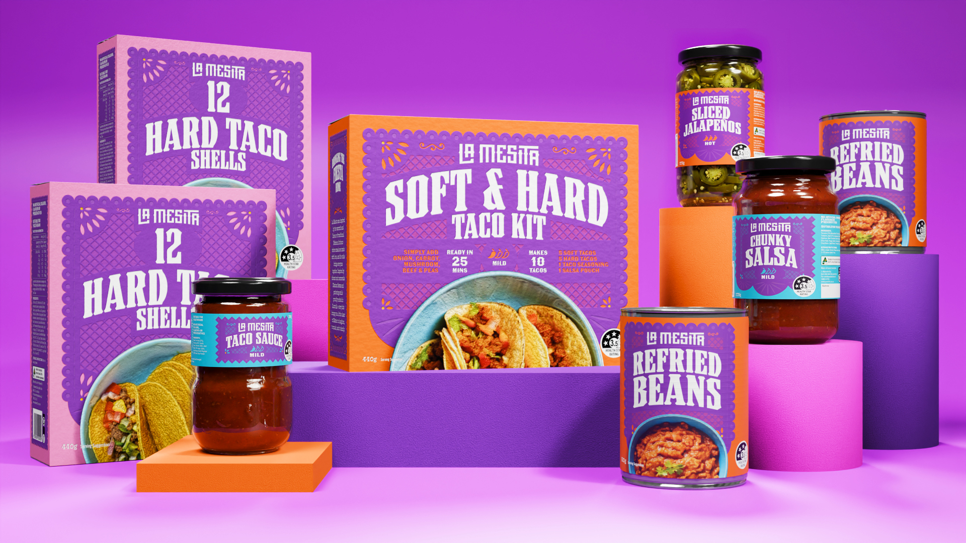
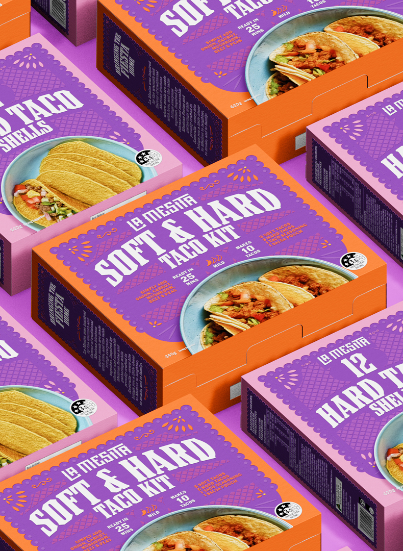
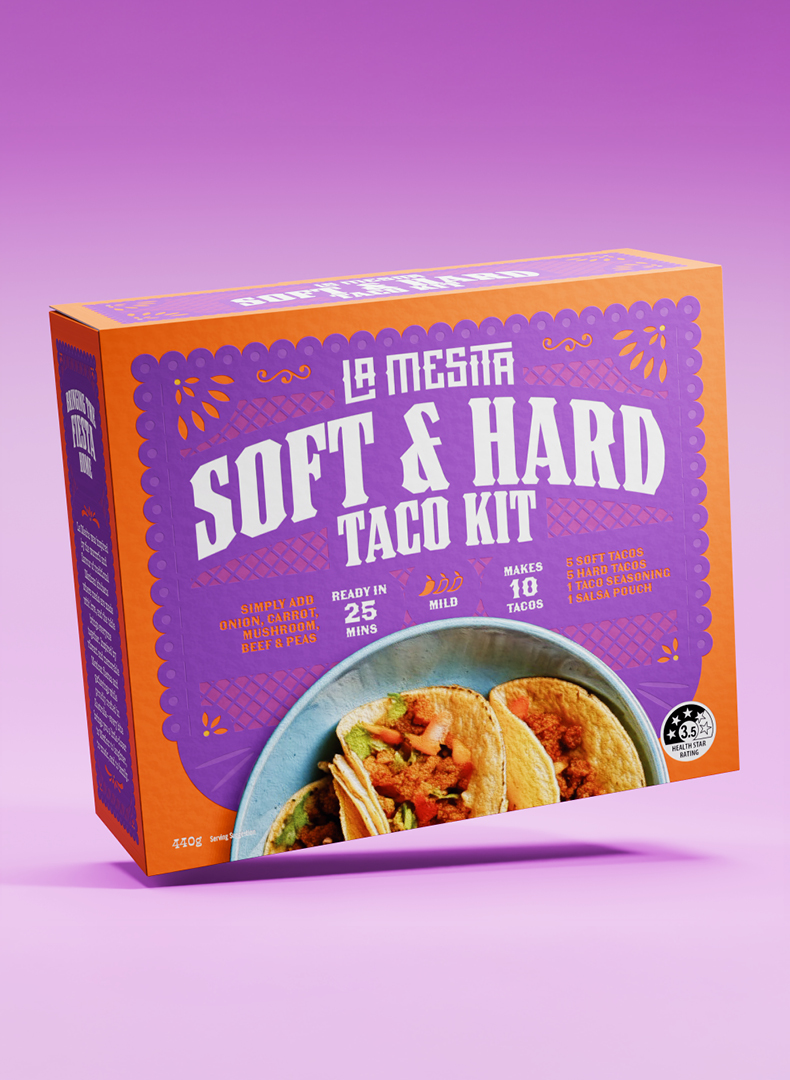
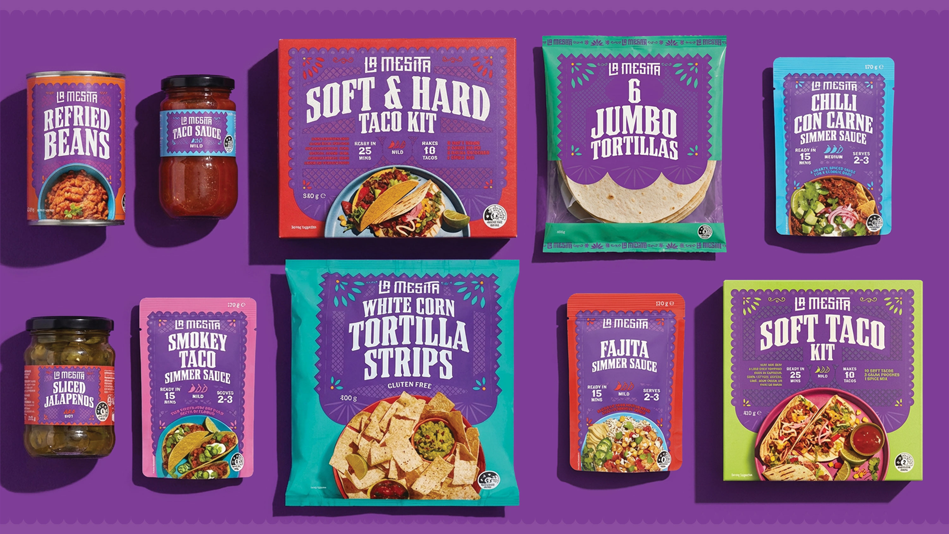
La Mesita’s packaging is a vibrant tribute to Mexico’s rich culinary and cultural heritage—expressive, warm, and unmistakably stylish. Each pack features bold colour paired with the iconic La Mesita wordmark and product typography.
Calling for a comprehensive Mexican pantry range, we designed La Mesita to give shoppers an authentic yet accessible way to explore Mexican cuisine at home. Created to fill a clear gap between premium national brands and entry-level private label, the range delivers quality, flavour, and cultural credibility at an affordable price point—responding directly to shifting consumer expectations and cost-of-living pressures.
The central challenge was differentiation. The Mexican category is dominated by a single mainstream player and crowded with dated “Tex-Mex” cues, generic colour palettes, and low perceived authenticity. To stand apart, the design needed to feel genuinely Mexican while remaining modern, ownable, and scalable across a broad multi-SKU range.
The design draws inspiration from papel picado (pecked paper), a traditional Mexican decorative craft, reinterpreted as a contemporary framing device across packs. Intricate cut-paper motifs are combined with saturated colour blocking and expressive typography to create strong brand blocking and immediate shelf impact. Each product variant is clearly differentiated through colour, making navigation intuitive in a busy supermarket environment.
La Mesita avoids clichéd tropes, instead celebrating Mexican culture through pattern, craft, and vibrancy. Transparent windows, appetite-led photography, and clear hierarchy balance emotional appeal with functional clarity.
The project demonstrates how own-brand packaging can move beyond utility to deliver cultural storytelling. For the client, the result is a flexible, future-proof design system that elevates the Mexican aisle, supports tiered expansion across categories, and builds trust through authenticity and standout shelf presence—showing good value doesn’t have to compromise on design.
Nationally launched at Woolworths, La Mesita offers delicious Mexican food that brings the fiesta home.


Selected Clients
Google

Nike

Woolworths

Macro

QV Melbourne

Burwood One

Mirvac

Westside India

Zudio India

Eva

Art of Soule

Play-ground Coffee

Total Fusion Platinum

Tourism Victoria

JCDecaux

Open House Melbourne

Linda Boronkay

Genius Childcare

Mayfield Childcare

The Next Step

Hale Gym & Spa

Accor Hotels

Little National Hotel

Osborn House

DOMA Hotels

Hotel Realm

Louis Restaurant

Med Restaurant

The Alby

Leyla Bar

The Motley Hotel

Evra Restaurant

Quincy

Dexus

GPT

ISPT

Cbus Property

Charter Hall

Stockland

Colliers

Grollo Group

DOMA Group

Cavcorp

LDK

Amber Property Group

CAPAX

Toga Group
Far East Group