51 Flinders
Tear away convention
The way we work has evolved, and people are breaking away from conformity. As a result, the lines between culture, business and lifestyle are blurring like never before.
Let’s tear up the rule book, tear up the tropes, tear up typical. Welcome to 51 Flinders Lane.
Built on a foundation of creative disruption, 51 Flinders rejects the quiet norms of the city’s business district. The brand utilizes a “tear-away” visual language, layering vibrant art direction and jolts of neon pink over scenes of monotonous corporate routine. By physically stripping back the imagery of the mundane, we unveil 51 Flinders as a destination defined by movement, color, and unapologetic character.
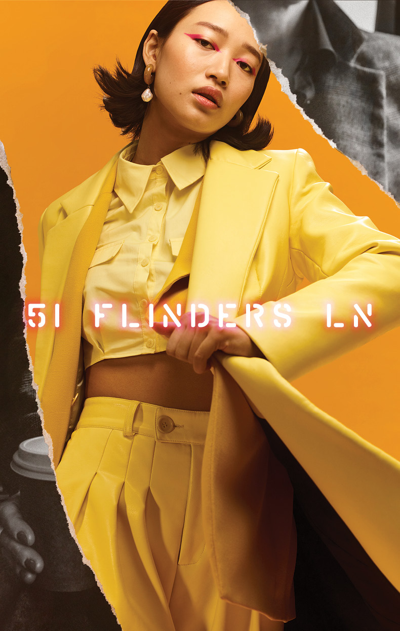
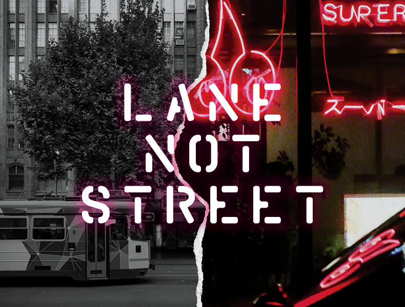
The brand identity finds its voice through the strategic pairing of defiant copy and bespoke stencil typography, an aesthetic that commands attention while signaling a fearless departure from conventional corporate design standards.
The custom typeface acts as a structural anchor for the brand’s unapologetic narrative. Together, they depict a brand that knows exactly who it is and refuses to lower its volume for the sake of convention.
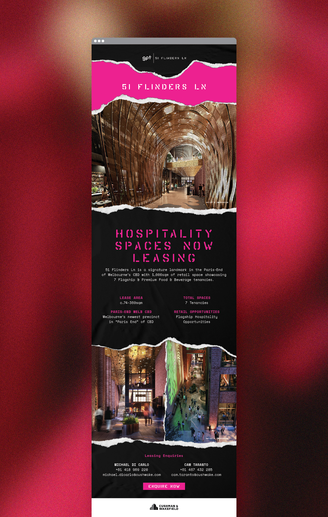
Whether it’s scaled for high-impact digital displays or distilled for minimalist print, the identity remains versatile. It navigates every application with ease, shifting its form to suit the medium without ever diluting its core message or unmistakable character.
More Projects
Strategy, Brand, Art Direction

Selected Clients
Google

Nike

Woolworths

Macro

QV Melbourne

Burwood One

Mirvac

Westside India

Zudio India

Eva

Art of Soule

Play-ground Coffee

Total Fusion Platinum

Tourism Victoria

JCDecaux

Open House Melbourne

Linda Boronkay

Genius Childcare

Mayfield Childcare

The Next Step

Hale Gym & Spa

Accor Hotels

Little National Hotel

Osborn House

DOMA Hotels

Hotel Realm

Louis Restaurant

Med Restaurant

The Alby

Leyla Bar

The Motley Hotel

Evra Restaurant

Quincy

Dexus

GPT

ISPT

Cbus Property

Charter Hall

Stockland

Colliers

Grollo Group

DOMA Group

Cavcorp

LDK

Amber Property Group

CAPAX

Toga Group
Far East Group