JUMPSUIT
Reputation is everything
JUMPSUIT are seasoned experts—trusted by C-suites, boards, and high-growth companies to navigate moments of risk, transformation, and visibility. While they had built reputations for others, their own brand lacked the elevated identity to match their authority and vision.
The task called for a refreshed identity that could walk the line between discretion and presence. Their design language should resonate with a full a spectrum of professionals, instilling trust and signaling innovation without being over-designed or too playful when conveying human authenticity. The challenge was to create a system that looked polished and worked hard—a flexible, editorial-inspired brand that could stand strong in boardrooms and across digital platforms. It had to convey what JUMPSUIT delivers every day: clarity, conviction, and control.

The refreshed identity centres on the concept of reflection—symbolising Jumpsuit’s ability to hold a mirror to brands and help them see themselves with renewed clarity.

A custom logomark, with symmetrical “J” and “T” characters, elegantly embodies this idea. The identity system pairs monochrome photography with sharp graphic motifs and typographic restraint, balancing warmth and professionalism.
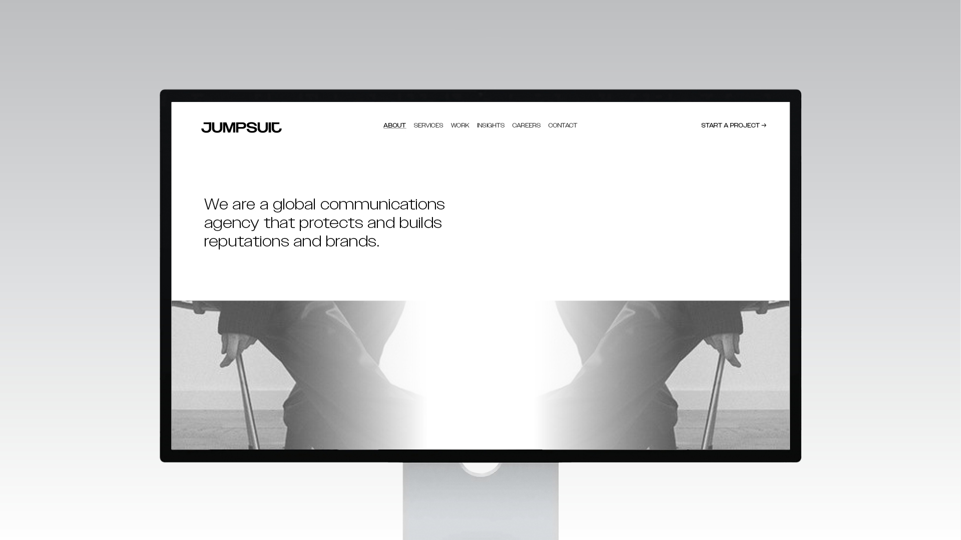
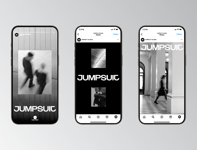
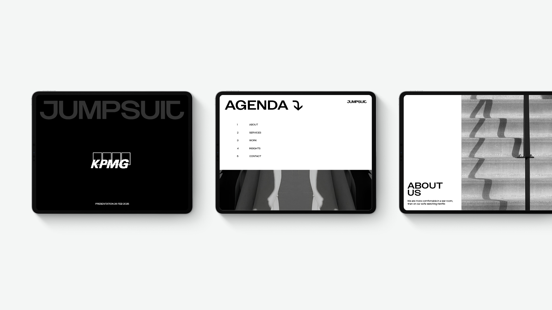
The monogram is equally strong in motion and stillness—adaptable across digital, print, and environmental formats. The result is a design language that communicates conviction, strategy, and discretion, while remaining visually distinctive and contemporary. It positions Jumpsuit as a trusted guide through transformation and growth.
More Projects
Branding, Strategy, Technology

Selected Clients
Google

Nike

Woolworths

Macro

QV Melbourne

Burwood One

Mirvac

Westside India

Zudio India

Eva

Art of Soule

Play-ground Coffee

Total Fusion Platinum

Tourism Victoria

JCDecaux

Open House Melbourne

Linda Boronkay

Genius Childcare

Mayfield Childcare

The Next Step

Hale Gym & Spa

Accor Hotels

Little National Hotel

Osborn House

DOMA Hotels

Hotel Realm

Louis Restaurant

Med Restaurant

The Alby

Leyla Bar

The Motley Hotel

Evra Restaurant

Dexus

GPT

ISPT

Cbus Property

Charter Hall

Stockland

Colliers

Grollo Group

DOMA Group

Cavcorp

Hesperia

Amber Property Group
