Quincy
Stay you
We crafted a scalable, sophisticated identity that connects guests with each city—alongside engaging touchpoints for cultivated travellers.
A Quincy for today and the future.
With the opening of Quincy House and ambitions for expansion, Quincy needed to elevate their visual and verbal expression while preserving the core brand DNA. Studio Payne was invited to define who Quincy is today and create a brand system flexible enough to grow with them.
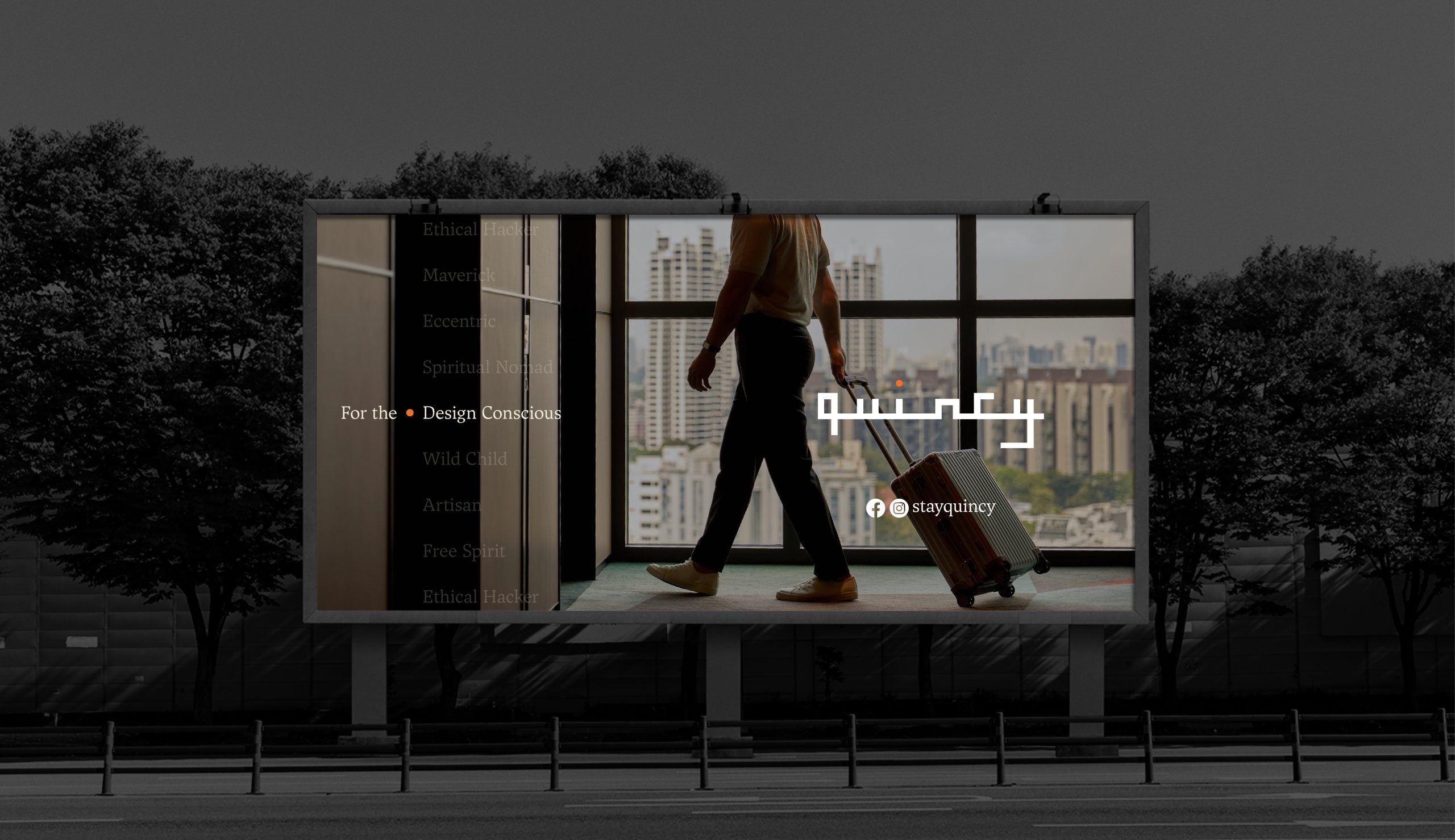
Working in collaboration with the Far East Hospitality team, and privileged to have visited Quincy House and Quincy Hotels (both Singapore and Melbourne), we met the incredible people behind the brand and experienced the difference Quincy creates every day.
We aimed to reflect the impact we felt personally to celebrate and curate an exciting new chapter for Quincy and empower the team to champion the new, refreshed brand.

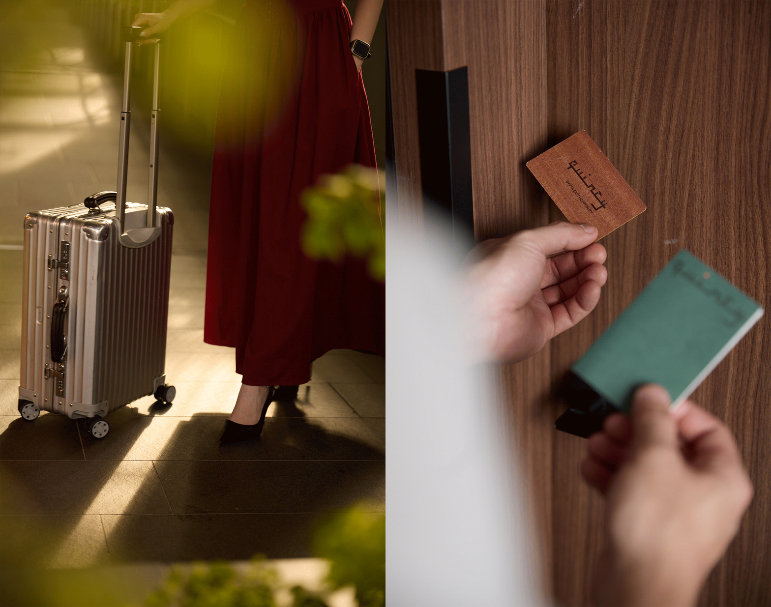
Through immersive research Studio Payne recognised that Quincy goes beyond anticipatory service, they create space for guests to be themselves. Outgrowing their ‘Quirky’ roots, the Quincy experience is calm, intelligent, and quietly confident.
An opportunity lay in shifting from visual branding to brand expression—allowing service, space, and curation to do the talking. Studio Payne repositioned Quincy as a place where individuality belongs—where curation is personal, hospitality has heart, and every stay feels intuitively designed around the guest.
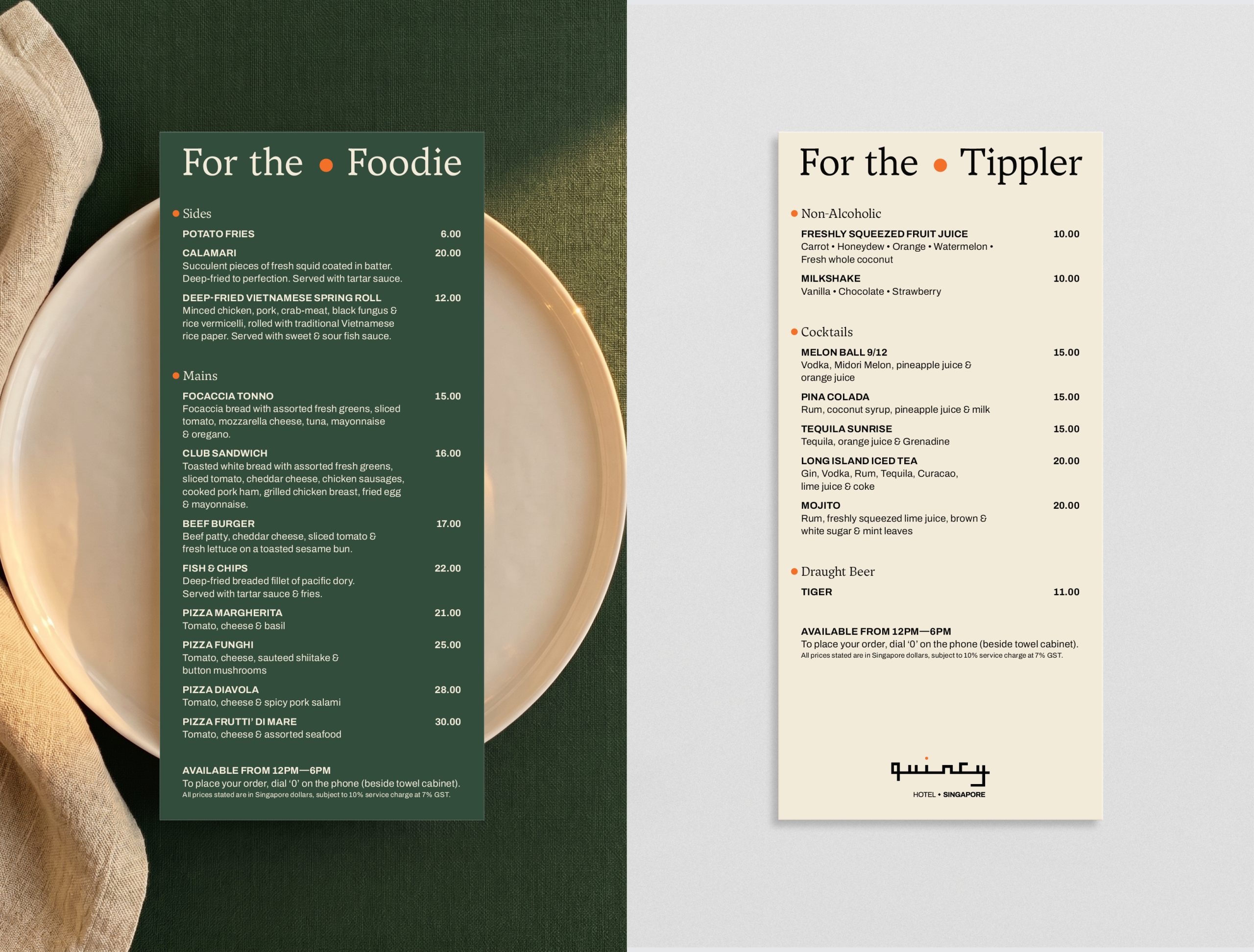
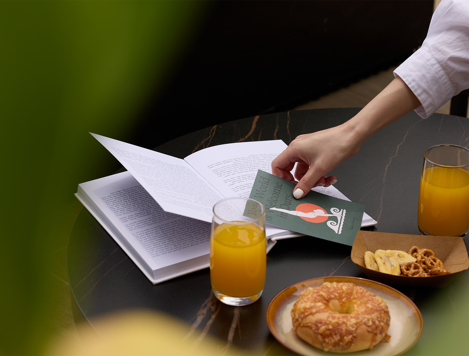
Elevating the brand expression to meet the experience offered, we finessed the existing Quincy framework to realise the brand’s full potential. Reflecting the intelligently designed, inviting spaces full of warmth we redefinied a point-of-view centred around how Quincy can support diversity of experience is an opportunity to evolve the brand.
From the historical cultural heritage and informed Qurator’s high-touch engagement to localised curation across brand touch-points, each city exercises the freedom of celebrating what their location can uniquely offer—understanding and providing different opportunities for guests to engage with “cool” experiences in a timeless way, without becoming cliché, kitsch or dated.

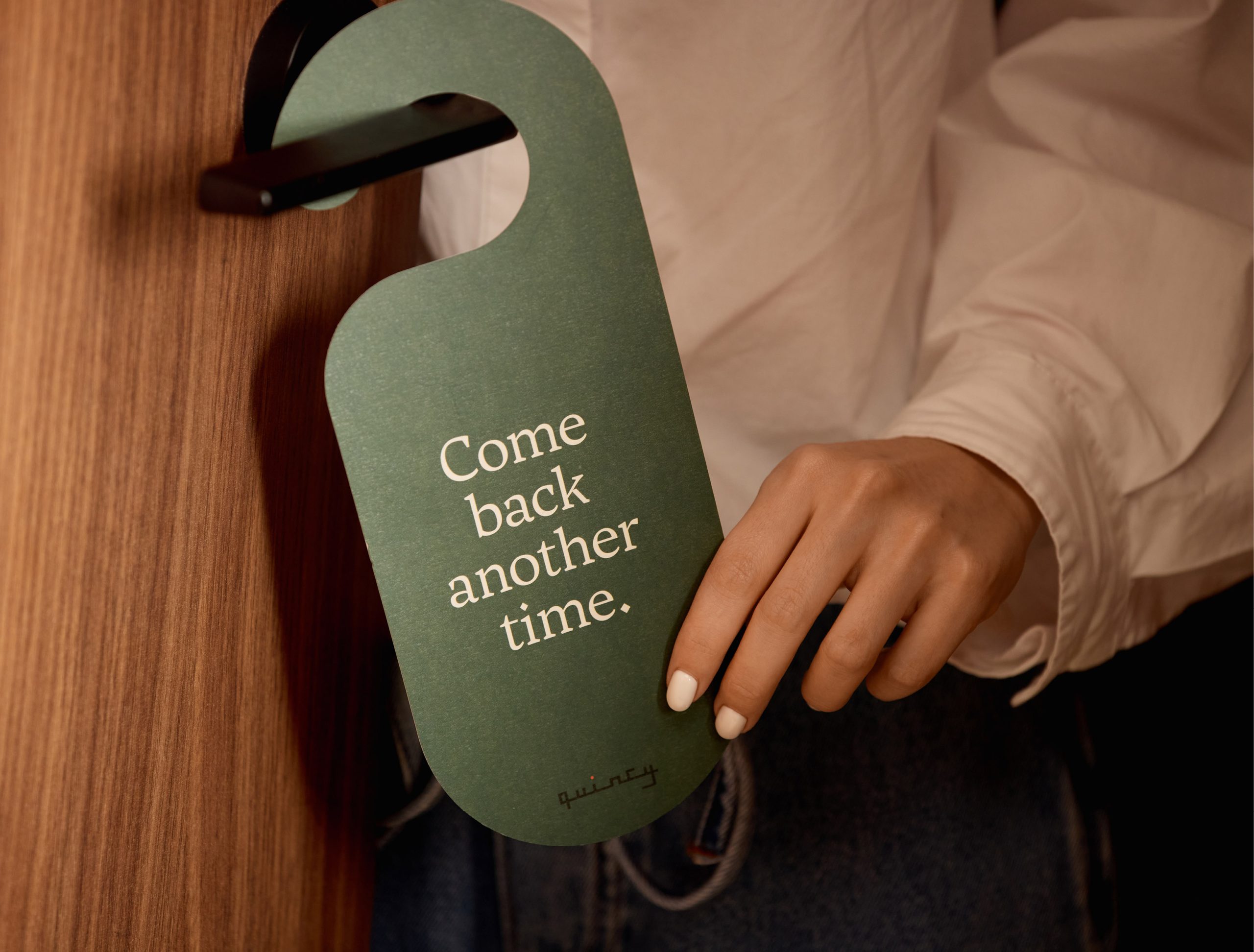
The brand identity was refined to reflect confidence and restraint.
Logomarks stepped back while experience stepped forward—every touchpoint became an opportunity to engage. A grounded colour palette anchored the brand, supporting calmness and clarity across locations while allowing local expression to shine. A flexible identity system was developed—built on thoughtful typography, restrained use of the Quincy dot, and an expressive illustration language. Photography favours authentic moments—capturing the expert eye of the Quincy Qurators.
The refreshed brand provides clarity for internal teams, consistency across locations, and freedom for guests to experience each stay in their own way. A brand not defined by rules—but by how it makes people feel.
At Quincy, stay you.
More Projects
Design, Strategy, Creative Direction, Art Direction, Illustration, Experience


Selected Clients
Google

Nike

Woolworths

Macro

QV Melbourne

Burwood One

Mirvac

Westside India

Zudio India

Eva

Art of Soule

Play-ground Coffee

Total Fusion Platinum

Tourism Victoria

JCDecaux

Open House Melbourne

Linda Boronkay

Genius Childcare

Mayfield Childcare

The Next Step

Hale Gym & Spa

Accor Hotels

Little National Hotel

Osborn House

DOMA Hotels

Hotel Realm

Louis Restaurant

Med Restaurant

The Alby

Leyla Bar

The Motley Hotel

Evra Restaurant

Quincy

Dexus

GPT

ISPT

Cbus Property

Charter Hall

Stockland

Colliers

Grollo Group

DOMA Group

Cavcorp

LDK

Amber Property Group

CAPAX

Toga Group

Far East Group